How to Create a Website Footer.
Website Footer Code below here..
Step-1:- Create a HTML Page .
1- index.html
Step-2:- Write the Code of (Index.html) Page.
Step-3:- And Now the time of CSS Pages.
1- style.css
Note: Social Icon are the Images and save the 3 Social Icon Images
Thanks
<!DOCTYPE html>
<html>
<head>
<title>Footer</title>
<link href=style.css rel=stylesheet type=text/css media=all />
</head>
<body>
<div class=a2>
<div class=a3>
<div class="footer one">
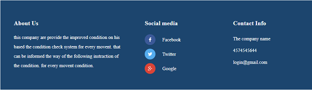
<h3> About Us</h3>
<p>this company are provide the improved condition on his based the condition check system for every movent. that can be informed the way of the following instraction of the condition. for every movent condition.</p>
</div>
<div class="footer two">
<h3>Social media</h3>
<ul>
<li><a class=f href=#><i></i>Facebook</a></li>
<li><a class=t href=#><i></i>Twitter</a></li>
<li><a class=g href=#><i></i>Google </a></li>
</ul>
</div>
<div class="footer three">
<h3>Contact Info</h3>
<ul>
<li>The company name <span></span> </li>
<li>4574545644 </li>
<li><a href=# style=color:white>login@gmail.com</a> </li>
</ul>
</div>
<div class=a1></div>
</div></div></div>
</body>
</html>
Step-3:- And Now the time of CSS Pages.
Create a CSS Page....
1- style.css
Step-4:- Write the Code of (style.css) Page.
ol,ul{list-style:none;
margin:0px;
padding:0px;}
a{text-decoration:none;}
.a1{clear:both;}
.a2{
margin: 0 auto;
width: 67%;}
.a3{
background:#1C456E;
padding: 3em 3em;
}
.footer{
float:left;
}
h3{
font-size: 18px;
color: white;
}
.footer.one {
width: 37%;
}
.footer.three {
width: 23%;
}
.footer.one p{
color:white;
line-height:2em;
font-size:14px;
}
.footer.two {
width: 23%;
margin: 0 8%;
}
.footer.two ul{
margin:0;
padding:0;
}
.footer.two ul li{
list-style-type:none;
display:block;
line-height: 1.5em;
font-size:14px;
}
.footer.two ul li a{
color:white;
display:block;
}
.footer.two ul li a.f {
background: url('../images/social2.png') no-repeat 0px 4px;
padding: 10px 0 12px 52px;
}
.footer.two ul li a.t {
background: url('../images/social1.png') no-repeat 0px 4px;
padding: 10px 0 12px 52px;
}
.footer.two ul li a.g {
background: url('../images/social3.png') no-repeat 0px 4px;
padding: 10px 0 12px 52px;
}
.footer.three ul li {
list-style-type: none;
display: block;
color: white;
font-size: 14px;
line-height: 2.5em;
}
.footer.three ul li span {
display: block;
}
.footer.two ul li a.f:hover {
color:#09F;
}
.footer.two ul li a.t:hover {
color:#09F;
}
.footer.two ul li a.g:hover {
color:#09F;
}
@media (max-width: 1440px){
.a2 {
width: 73%;
}
}
@media (max-width: 1366px){
.footer.one {
width: 38%;
}
.a3 {
padding: 2.5em 2.5em;
}
}
@media (max-width: 1080px){
.a2 {
width: 80%;
}
.footer h3 {
font-size: 19px;
}
.footer h3 {
font-size: 18px;
}
}
@media (max-width: 1024px){
.footer-a3 {
padding: 2em 2em;
}
.a2 {
width: 82%;
}
@media (max-width: 991px){
.footer.two {
width: 27%;
margin: 0 5%;
}
.footer.three {
width: 25%;
}
}
@media (max-width: 800px){
.a2 {
width: 88%;
}
.footer.one p {
font-size: 13px;
}
.footer.two ul li {
font-size: 13px;
}
.footer.three ul li {
font-size: 13px;
}
.footer h3 {
font-size: 16px;
}
}
@media (max-width: 768px){
.a2 {
width: 90%;
}
@media (max-width: 736px){
.footer.one {
width: 35%;
}
.footer.two {
width: 29%;
margin: 0 4%;
}
.footer.three {
width: 27%;
}
}
@media (max-width: 667px){
.footer.one {
width: 100%;
}
.footer.two {
width: 48%;
margin: 0 4% 0 0;
}
.footer.three {
width: 48%;
}
.footer.one {
margin-bottom: 40px;
}
}
@media (max-width: 640px){
.a3 {
padding: 2.5em 2.5em;
}
@media (max-width: 480px){
.a3 {
padding: 1.5em 1.5em;
}
@media (max-width: 414px){
.footer.two {
width: 100%;
}
.footer.three {
width: 100%;
}
.footer h3 {
margin-bottom: 18px;
}
.footer.one {
margin-bottom: 0;
}
.footer.two {
width: 100%;
margin: 30px 0;
}
@media (max-width: 320px){
.a3 {
padding: 1em 1em;
}
Note: Social Icon are the Images and save the 3 Social Icon Images
in images folder.
Thanks


Comments
Post a Comment